“It is remarkable how much long-term advantage people like us have gotten by trying to be consistently not stupid, instead of trying to be very intelligent.” – Charlie Munger
Global equity markets are signaling we’re back to business as usual. Or it seems equities are indicating the worst-case scenario outcomes are no longer on the table. Still, there is plenty to make a rational investor proceed with caution.
There’s the obvious stop signs: real economy and equity markets are disconnected, valuations are high, the risk of a second wave of infections, election year, trade war, etc.
These are widely acknowledged risks. Our job is to look for not-so-obvious potential land mines.
We mentioned rising bond yields would go a long way to validate the upward trajectory of equities.
Furthermore, we would like to see the wild price swings or standard deviation, both up and down, settle down a bit.
Standard deviation is a statistical measurement in finance that, when applied to the annual rate of return of an investment, sheds light on the historical volatility of that investment. The greater the standard deviation of securities, the greater the variance between each price and the mean, which shows a larger price range. For example, a volatile stock has a high standard deviation, while the deviation of a stable blue-chip stock is usually rather low. Source: Investopedia
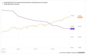
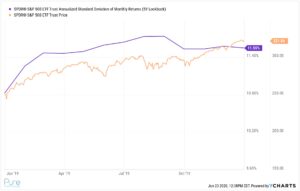
Healthy bull markets generally consist of slow melt-ups rather than huge daily bursts higher. 2017 & 2019 are perfect examples of a blissful market…

Source: YCharts
The above graph shows standard deviation or risk (purple) and the S&P 500’s (orange) price moves for 2017. It was a steady upward climb with very little bumps in the road for investors.
2019 was a similar story…

Source: YCharts
The above graph shows standard deviation or risk (purple) and the S&P 500’s (orange) price moves for 2019. It was a touch rockier in 2019 due to trade negotiations with China, but a walk in the park compared to 2020.
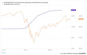
The moves we are seeing today are the opposite of slow and steady. Even if we ignore the COVID sell-off in March, we are still seeing some pretty massive moves by historical standards.

Source: YCharts
The above graph shows standard deviation or risk (purple) and the S&P 500’s (orange) price move for 2020. You can see risk is drastically higher which is consistent with the choppy action in the S&P. We would like to see a tighter range of daily swings for the S&P 500 index.
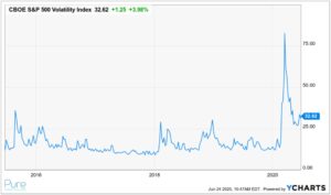
Finally, there’s the VIX index, which shattered previous records for volatility…

Source: YCharts
The above chart shows the CBOE S&P 500 VIX Index over the past five years. The VIX is derived from the prices of S&P options. In simple terms, the higher the VIX number, the greater range of potential outcomes for the S&P. You can see the dramatic spike in the VIX during the COVID-19 sell-off in March. Current levels of the VIX are still elevated (as of 6/24), especially compared to 2017 and the second half of 2019.
What does it all mean? The market doesn’t deal in absolutes. It’s not full-steam ahead of uninterrupted gains or catastrophic losses with nowhere to hide. Like anything in life, there are various shades of gray and the truth is somewhere in between bliss and caution.
For bulls, don’t get too far ahead of yourselves. The current market movements are anything but normal. For bears, price is always right. The market doesn’t care if its actions are irrational. Whether optimistic or pessimistic, acknowledge your biases and try to avoid the extremes at either end.
