“Wealth isn’t primarily determined by investment performance, but by investor behavior.” – Nick Murray, finance author & speaker
The U.S. equity market has come roaring back in 2023 catching many by surprise.
Source: Bespoke Investment Group
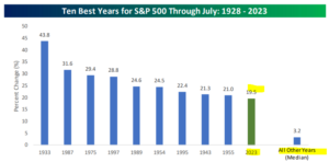
The above graph shows the 10 best years for the S&P 500 through July (1928 – 2023). 2023 comes in as the 10th best start through July since 1928. Not many predicted an aggressive bounce back coming off a historically horrid 2022.
Despite the positive market action, some are convinced we aren’t out of the woods yet.
The Fed is still tight.
Inflation is elevated.
Performance is concentrated in a handful of mega-tech companies.
There’s too much debt.
Interest rates are too high.
The list goes on.
It would seem there’s no shortage of things that could go wrong, but that’s true at any point in history. To our knowledge, there isn’t an indicator that flips on and allows investors to clip uninterrupted gains with zero risk.
Given the headwinds and the solid gains to start the year; is the market detached from reality?
We examine how current returns stack up vs. average historical returns for the S&P 500.
Source: Bespoke Investment Group
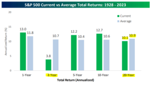
The above graph shows S&P 500 current (green, through July 2023) vs. average total annualized returns over 1-year, 2-year, 5-year, 10-year, and 20-year periods (gray). It’s been a good run for U.S. stocks over the past 10 years, however, returns are not disconnected from average annualized returns over the long run (20-years).
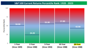
Looking at the percentile ranking confirms how aligned current returns are vs. the last ~95 years. In fact, 20-year S&P 500 returns are below their historical average. We don’t make predictions, but this doesn’t look like an equity market that’s unhinged from a historical return perspective.
Source: Bespoke Investment Group
The above graph shows S&P 500 current return percentile rank (through July 2023) vs. average total annualized returns over 1-year, 2-year, 5-year, 10-year, and 20-year periods. For example, a percentile rank of 50% would indicate returns that are perfectly average relative to history. The 2-year and 20-year return figures are below the historical average. While U.S. equities could sell off from here, it doesn’t seem like the market is stretched relative to history.
Do you know what is unhinged from history? Long-term U.S. Treasury bonds (10+ year maturities).
Talk about a rough go…
Source: Bespoke Investment Group
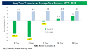
The above graph shows current long-term Treasury returns (green) vs. average total returns (1977 – 2023) over 1-year, 2-year, 5-year, 10-year, and 20-year periods (gray). 2022 was one of the worst years ever for bonds, especially for longer maturity issues. Unexpectedly high inflation and an aggressive Fed rate hiking campaign wreaked havoc on the bond market.
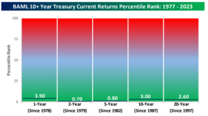
The 10+ Treasury indexes current return percentile rank outlines how historically awful long-term bond performance has been…
Source: Bespoke Investment Group
The above graph shows long-term Treasury (10+ year maturities) current return percentile rank (through July 2023) vs. average total annualized returns over 1-year, 2-year, 5-year, 10-year, and 20-year periods. There’s not much to say here, current long-bond returns are some of the worst on record.
It turns out there is a market that’s unhinged from a historical perspective, but it isn’t equities.
In summary…
- Despite the wild market swings over the past 18 months, S&P performance is roughly in-line with historical return averages.
- Long-term (10+ year maturities) Treasury bond performance has been historically abysmal.
- An astute investor might find value in longer-term bonds, especially if the Fed cuts rates and yields fall.
Every now and again, it’s prudent to zoom out, block out the short-term noise, and evaluate current market conditions with historical data.
Want to learn more about Pure Portfolios’ rules-based investment process? Click here to learn more.
