“Take calculated risks. That is quite different from being rash.” – George S. Patton
Let’s say I’m invited over to your house for dinner. We don’t know each other very well, but sharing a meal will change that.
The night of the dinner, I’m running slightly behind. Feeling a bit flustered, I feverishly check Google Maps for the quickest path to your house. I pride myself on never being late.
I resist the urge to speed or drive recklessly. I stick to the speed limit, never looking down at my phone, even as the friendly Google Maps voice announces the next turn.
I pull into your driveway exactly on time. You peek out the window and greet me with a warm, friendly wave.
Let’s call this dinner guest #1.
Same scenario, but this time we are dinner guest #2.
The night of the dinner, I’m running slightly behind. Feeling a bit flustered, I feverishly check Google Maps for the quickest path to your house. I pride myself on never being late.
To calm my nerves, I take a quick nip of Jack Daniels. For good measure, I take the bottle with me in case traffic is bad.
I blast the radio playing my favorite Justin Bieber jam. While the annoying Google Maps voice firing directions at me, I check my Facebook status to see how many likes I received on my latest post.
I don’t even know the posted speed limit. To make up time, I’m weaving in and out of traffic. Google Maps says I’m getting close to my final destination. Perfect. Just enough time to take a few more gulps of brown whiskey.
I pull into your driveway exactly on time. You peek out the window and greet me with a warm, friendly wave.
In both scenarios, the only information my host sees is that I’ve arrived for dinner. They have zero knowledge about how I got there.
Investors that exclusively focus on their portfolio performance are likely doing the exact same thing. Performance without the context of the journey (risk) could be setting your portfolio up for a major blow up. The worst part is you might not even see it coming.
Unfortunately, not even acknowledging a portfolio’s journey is commonplace. Investors don’t know where to find it. Most advisors can’t produce risk metrics or don’t share this information with clients.
Here are a few suggestions to provide vital context to your performance number.
Are You Really Diversified?
You should understand how each of your portfolio holdings move in relation to each other. There’s a perception that the more individual holdings within a portfolio, the greater diversification. That might be true, but it can also be wildly incorrect.
Let’s assume portfolio A owns 30 individual stocks in the energy sector. Portfolio B owns two ETFs: U.S. Large Cap and the Barclays Aggregate Bond Index.
Which is more diversified?
I would strongly argue the two-ETF portfolio. Only two holdings, but much more balanced than thirty energy stocks.
In my opinion, this is especially important for an investor that has accounts scattered at various financial institutions. The investor might believe they are acting prudently by using different advisors or managers, but unknowingly loading up on one area of the market. What if both advisors are optimistic about the prospects of big technology companies? You could have heavy risk exposures to one sector and not even know it.

Source: Portfolio Visualizer
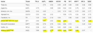
The above matrix shows a handful of technology companies, S&P 500 ETF (SPY), and Nasdaq ETF (QQQ) over the past two calendar years. The numbers within the matrix show how each asset moves in relation to another. For example, notice how high the correlation of 0.90 is between QQQ (bottom left) and AAPL. This means if QQQ goes up or down by 10%, AAPL will almost mirror the move. The concentration in technology might be intentional, but it might not be. If you don’t understand how assets move in relation to one another, you might be in for a negative surprise.
Track the Journey
Let’s say two portfolios produce an 8% return in 2020. Which one would you prefer?
I believe it’s an impossible question to answer correctly without knowledge of the journey or what they own. Yet, so many investors aren’t even asking the question.
Every do-it-yourself (DIY) investor and those working with a financial advisor should be able to produce a variation of the below risk metrics…

Source: Pure Portfolios, hypothetical portfolio
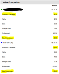
The above shows portfolio performance with broad risk metrics i.e. standard deviation, max drawdown vs. the S&P 500. I would call this a very efficient portfolio. It produced over half of the return of the S&P index, while taking only 40% of the risk. If I’m hyper-focused on the return of 10.24%, I’m completely missing the context of the journey.
Look at the Drawdown
If you’re an investor focused on capital appreciation, then tracking maximum drawdown over a period is important. Maximum drawdown captures how much of your initial investment you lost during the worst market conditions. It’s essential to look at all potential outcomes and determine what kind of drawdowns you are comfortable with. This helps set realistic expectations for future
Here’s another graph that provides a simple, graphical summary of risk…

Source: Pure Portfolios, hypothetical portfolio
The above shows the same portfolio (green) vs. the S&P 500 (blue) from the first graphic. This time, we show peak-to-trough drawdowns for 2020. Notice that during the spring COVID sell-off, the S&P cratered over 30%. The green portfolio “only” dipped by 12%. Again, this is a great way to capture the entire story of return and risk.
Dinner guest #1 and dinner guest #2 had the same output (arriving “safely” to a dinner party), but took completely different journeys. Is your portfolio dinner guest #1 or dinner guest #2?
How would you even know?
