Picture a veteran stock broker roaming the halls of a investment advisory firm. His shirt is stained with coffee. From the look of his wrinkled suit it seems he slept under his desk last night. In his hands is a graph of a yield curve with highlights, scribbled text, and the words “RECESSION!!!” across the top. He stops anyone that will listen to mumble something to the effect of “the yield curve has inverted and a recession is coming soon. This is very bad news for the equity markets.”
This is happening all over America as we speak.
Let’s be straight. A yield curve inversion, when short-term yields are higher than long-term yields, isn’t a sign of economic strength. Quite the opposite. However, like most things in the complex world of finance, there are no hard and fast rules.
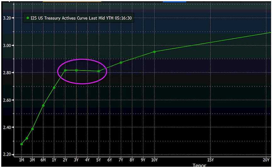
Here’s what happened on 12/4/2018:

Source: Bloomberg
The above graphs shows the 2-year yield moving higher than the 5-year yield.
Ok, what’s the big deal you might ask?
There is a historical relationship between yield curve inversions and economic recessions, however…
- The yield curve didn’t really invert in the traditional sense, rather flattened
- Inversions tell us very little about the timing of the next recession
- Not all flat yield curves result in recessions or equity market carnage
We wrote about this on November 30, 2016, stating that investors are more likely to buy or hold long-term treasuries in a recessionary environment.
There’s also the issue of cause and effect. For example, a yield curve inversion didn’t cause the Great Financial Crisis. Rather, the yield curve inverted because of a shoddy loans, reckless banks, and good old fashioned American greed.

Source: Bespoke Investment Group
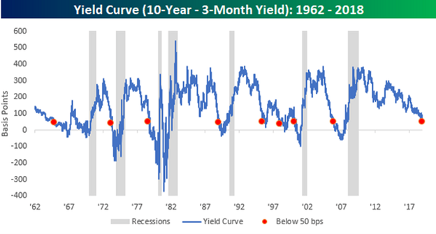
The above graph shows the difference between the 10-year Treasury yield and a 3-month Treasury Note. The lower the spread between the 10-year and 3-month yields (red dots), the flatter the yield curve. You can see in the mid 1970s, late 1980s, and twice in the 2000s the blue line goes fully negative (true inversion). The gray columns indicate recessionary periods. As of this writing, we are at the flattest level in 11 years, but not technically inverted.
What does that mean for U.S. equity markets moving forward?
We have no clue, but we can look at previous periods to gain some context.

Source: Bespoke Investment Group
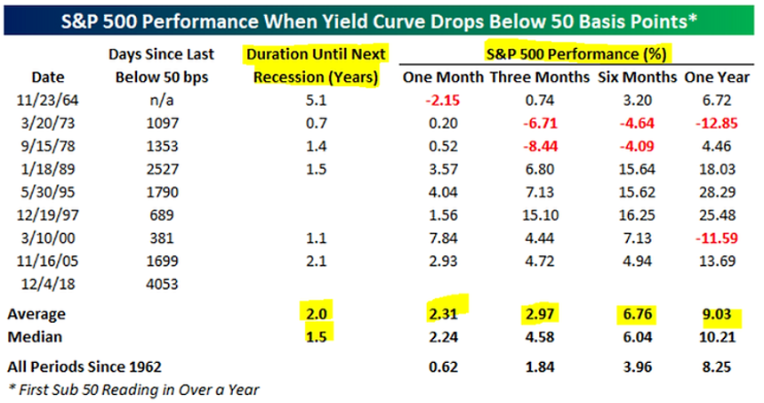
The above graph shows historical S&P 500 performance when the yield curve gets unusually flat. There are some ugly return periods in the mid-1970s, however, most of the performance numbers are actually pretty good. You can also see the duration until the next recession (highlighted above) which shows a range from seven months to over 5 years! That doesn’t provide much predictive value.
To summarize…
- The yield curve is unusually flat, but not inverted
- Inverted yield curves have been an accurate predictor of recessions, but tell us nothing about timing
- Stock market returns following periods of flat yield curves have been pretty good (with a few exceptions)
- You won’t remember any of this a year from now
