We hunt the internet for the best value. We read online reviews before making a purchase decision. We compare the leading brand with a less expensive, but functional alternative. This is a daily routine for many Americans that buy consumer goods and services. The internet has changed the way we consume information and make decisions.
If only we used that same diligence with our investments.
When we hire a financial advisor, we assume that person is acting in our best interest. We are hesitant to get involved because financial matters are intimidating and confusing. But, how do we know we are invested properly? When was the last time we had an objective comparison? Do we really know what fees and expenses we’re paying?
We offer a portfolio wellness check-up through the lens of an Evidence-Based Investor.
Does your portfolio reflect how you feel about risk?
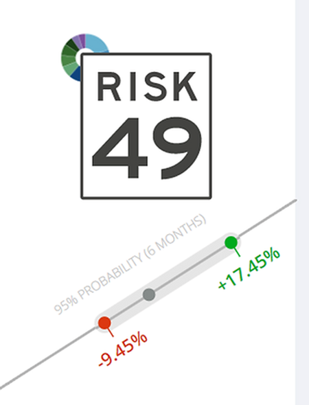
Many advisors use a subjective process to build portfolios. The age-based allocation is the most popular mental shortcut, i.e. old investors should be conservative and young investors should be aggressive. This can be true, but can lead to incorrect allocations. We prefer a rules-based approach that assigns a range of outcomes based on how the investor views risk, opportunity, and the world.
Shortcut: If 2018 has made you uncomfortable, you’re probably invested incorrectly.
What internal fund expenses are you paying?
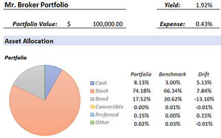
In the information age, not understanding how your advisor gets paid can be costly (literally). Don’t accept vague or dismissive responses. Ask for your total cost of investing in writing. Also, if something sounds too good to be true, it probably is (My Advisor Doesn’t Charge a Fee).
Shortcut: Active mutual funds carry heavy expense ratios that can exceed 1%. Worse yet, over the past 15 years, ~90% of U.S. Large Cap funds have failed to beat their benchmark. The results are similar for U.S. Mid/Small Cap, International, and Emerging Markets. In our opinion, picking market-beating mutual funds is an exercise in futility backed by evidence.
Are you making unintended sector bets?
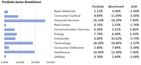
You should have a basic understanding of your sector exposures relative to a respective equity benchmark. The drift (third column above) shows how much less or more you own of a particular sector. In the example, the portfolio is heavily allocated to the financial services sector (7.85% overweight). We find this most common with folks who work for, or are retired from a specific industry. They tend to own what they know, which is fine, but you need to mindful of large active concentrations.
Shortcut: You might be making an unintended sector bet and not even know it. Make sure to consider your total investable assets when making allocation decisions. If you have multiple investment accounts and look at them in silos (mental accounting), that can lead to concentrations or skewed allocations.
Are you biased toward a style or company size?
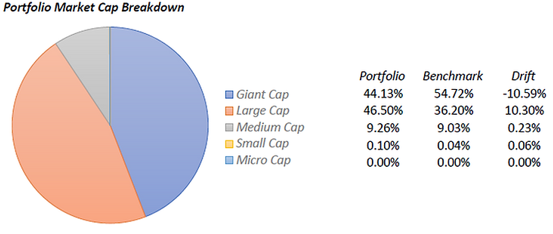
Generally, larger companies are more stable, recognizable, and more likely to pay dividends. Smaller companies offer greater prospects for growth and tend to be more risky. In the above example, the portfolio is underweight Giant Cap and overweight Large Cap.
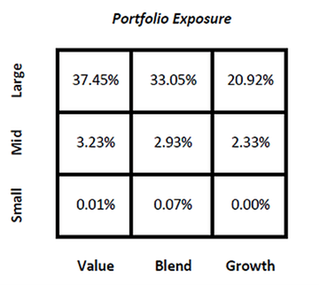
The portfolio exposure box is a clean way to combine size & style. Growth has been in favor over the past ten years with the technology sector leading the way. The value style, finding good companies which are trading at a discount, has historically generated excess returns.
Shortcut: If your portfolio has a bunch of holdings it will be tough to understand size, sector, and style exposures. To run an analysis similar to this blog exercise, all we need is a complete list of holdings.
How have you performed relative to a reasonable benchmark?


Performance isn’t everything, but you should have an idea of how you’ve done relative to a reasonable benchmark. The definition of “long-term” has been shrinking for years, but a 3 year performance number is a decent starting point for evaluation (remember to account for fees and taxes!). It’s good to look at both annualized performance and calendar year returns for context.
The above chart shows the best & worst returns for a hypothetical portfolio. Not surprisingly, the worst 1 month, 3 month, and 1 year returns occurred in 2008. This is useful to put risk into context and understand the depth of negative outcomes.
Shortcut: performance should be readily available for review. It shouldn’t be a chore or special request to generate a performance report. If your advisor deflects your performance questions or can’t produce net of fee performance, it’s time to look elsewhere.
What’s important to know in my bond portfolio?

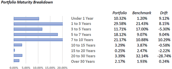
Effective duration shows how sensitive your portfolio would be to a 1% change in interest rates. In the above example, a 1% interest rate increase would result in a ~4.20% loss for our sample portfolio. By understanding your duration, you can start to see how an increase in interest rates will affect your bond portfolio.
Credit quality (or Avg. Credit Score) gives us insight about the ability of the borrower to pay interest and principal. Much like individuals have personal credit scores, bonds are given ratings to help investors make informed lending decisions.
Yield to maturity is the approximate total return one will receive on a bond if held to maturity.
You should be mindful of your maturity schedule (second graph) which simply shows when you will receive your money back from the borrower.
I have said it before and I’ll say it again, bonds are the most mismanaged asset class within portfolio management. It’s also where a good investment manager can add the most value (and vice versa for a poor manager).
Shortcut: Fees always matter, but with bond yields at historic lows it’s imperative to get it right. Compare your bond allocation’s yield to maturity (YTM) vs. the fees & mutual fund expenses you are paying. You could be holding a “dead” asset class, i.e. paying 2% for a bond allocation that produces a total return of ~2%. It doesn’t make any sense, but it happens all the time.
Finally, the low yield environment has encouraged investors and advisors to reach for additional yield by purchasing lower quality (high-yield or junk) bonds. I wouldn’t be rushing to turn my safe, fixed income portfolio into a risky basket of securities for a bit of extra yield.
If it’s been awhile since you had a professional investor evaluate your portfolio, give us a shout. The past nine years of an appreciating stock market can mask portfolio inefficiencies, high cost investments, and embedded risk waiting to implode.
*The performance and portfolio characteristics of this blog are for illustrative purposes only.
