We were sitting outside on a beautiful late summer Portland day. I was having a spirited conversation with a retired prospective client who was working with another advisor. The gentleman was unhappy with performance.
“This is BS. I might just put my money in the S&P 500 and call it good.“
It was almost uttered as a veiled threat. Half crazy talk, but hardly the worst thing I’ve heard. After all, the S&P 500 has been a runaway freight train for the past decade.
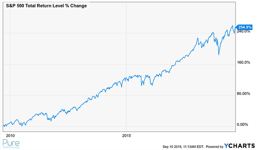
Source: Ycharts
The above graph shows the S&P 500 index over the past 10 years. The popular index has appreciated 2.5x since 2009 or ~13.50% per year. Not too shabby!
Should a retiree invest 100% of their assets in the S&P 500?
Depends on the retiree’s stomach.
The S&P 500 costs basically nothing to own, is easily accessed, and has gone up over time. Doesn’t sound too bad, right?
The S&P 500 is a market-capitalization weighted index of the largest U.S. publicly traded companies. The index is widely regarded as the best gauge of large-cap U.S. equities (source: Investopedia).
Here’s what S&P 500 investors should know:
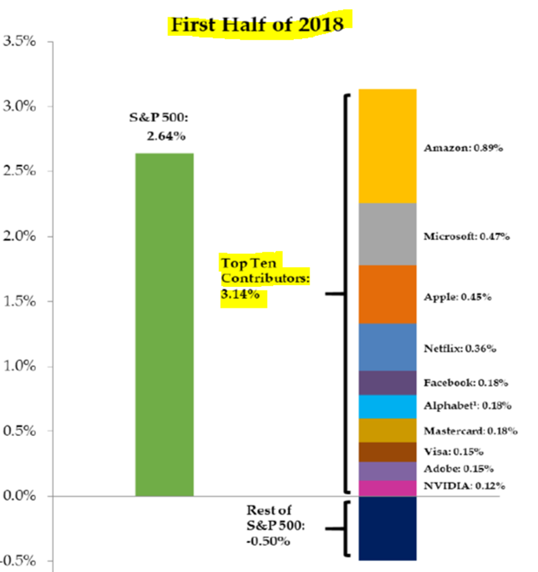
As a market-cap weighted index, the biggest companies “explain” a good chunk of the S&P’s performance. While the index is comprised of 500 companies, performance is driven by a select few. Critics of market-cap weighted index say you’re buying the most expensive companies while ignoring those that could be undervalued.
Source: Factset, Pure Portfolios Q3 2018 Market Commentary
The above graphic is from the first half of 2018. The performance of the S&P 500 was “explained” by a narrow concentration of ten companies (right stack). An investor could be lulled into the false sense of diversification.
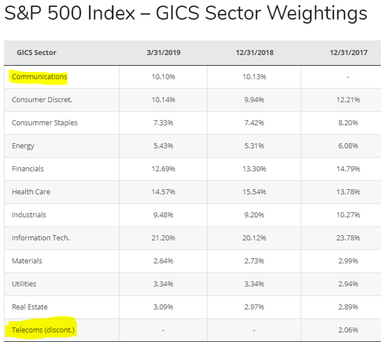
The underlying composition of an index evolves over time. The S&P Dow Jones Indices (division of S&P Global) investment committee decides which companies are included in the index every quarter to proxy the U.S. equity market (some argue the process is subjective and the “passive” index is very much active in its construction and ongoing management). S&P decides which companies get the boot and which get added.
Source: Siblis Research
The above graphic shows the evolution of the S&P 500’s sector weightings. Not only can the individual companies change, but sectors can be reclassified. The most recent change saw Telecoms being discontinued and Communications being added.
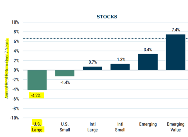
Valuation is a poor timing tool, but does have some predictive value for projecting longer term returns. According to GMO, U.S. large cap stocks are projected to return -4.2% annualized over the next seven years (real returns, after inflation). If this even comes close to fruition, this is hardly something to get excited about.
Source: GMO
The above graphic shows estimated projected returns for the next 7 years (as of 3/31/2019). The lower future return estimate for U.S. Large Cap stocks is a reflection of the lofty starting point. Higher returns today historically have meant lower returns tomorrow.
Humans tend to extrapolate recent events, positive or negative, into the future. This is known as recency bias.
Right now, the S&P is a darling. In 2010, plowing money into the S&P 500 index and “calling it good” would have been unheard of.
Source: Ycharts
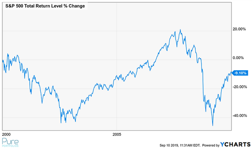
The above graph shows the S&P 500 from 1/1/2000 to 1/1/2010. An investment in the S&P 500 would have lost 9.10% over a period of 10 years. It wasn’t exactly a smooth ride either. This period would later be dubbed the “lost decade” for U.S. stocks.
More recently, over the past 12 months the S&P 500 has been exhibiting some squirrelly behavior.

Source: Orion
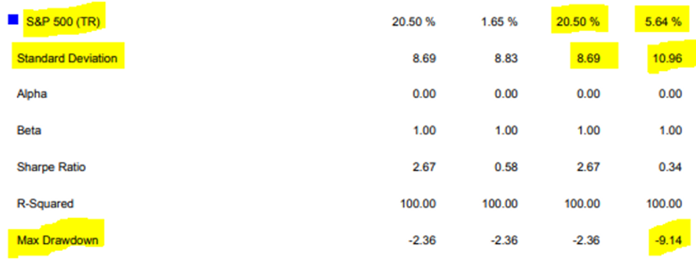
The above graphic shows the total return and standard deviation (the higher the number, the more risky) for the S&P 500 over QTD, YTD and 1-Year. The YTD numbers look great, but the last 12 months tell a different story, especially when we compare the above risk/return numbers to bonds (see below).

Source: Orion
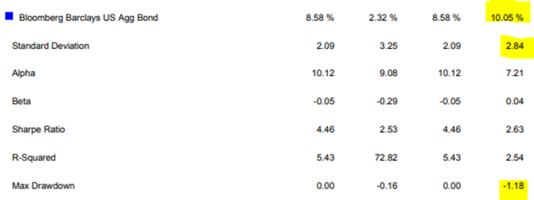
The above graphic shows the total return and standard deviation for the Bloomberg Barclays US Agg Bond Index. The numbers show bonds have vastly outperformed stocks over the past 12-mo while taking 74% less risk. An investor focusing on YTD performance of the S&P without taking into consideration risk, is missing the bigger picture.
For retirees that depend or live off their portfolios, exclusively owning the S&P 500 and calling it good is a perilous proposition.
Share your questions and feedback on Twitter @pureportfolios or insight@pureportfolios.com
