Many U.S. based investors believe so.
In the investment universe, “Home Bias” is a term used to describe the tendency to own a heavy allocation of stocks domiciled in your home country. It’s not just a U.S. problem either. For example, Canadian equities represent roughly 3.5% of the global market. However, Canadian investors own ~60% of stocks domiciled in Canada (source: Vanguard, for the purposes of this post, we will focus on the U.S. based investor).
Why does the U.S. investor tend to gravitate to stocks in their home country?
There are practical reasons like lower transaction costs to buy and sell securities, dealing with one currency, and familiarity (buy what you know). Post financial crisis, there is something else at work, huge outperformance of the U.S. markets vs. the rest of the world. By all accounts, many U.S. based investors are exhibiting recency bias, or over-weighting recent positive results and extrapolating into the future.
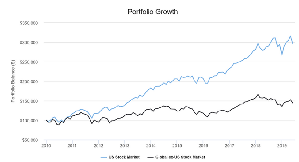

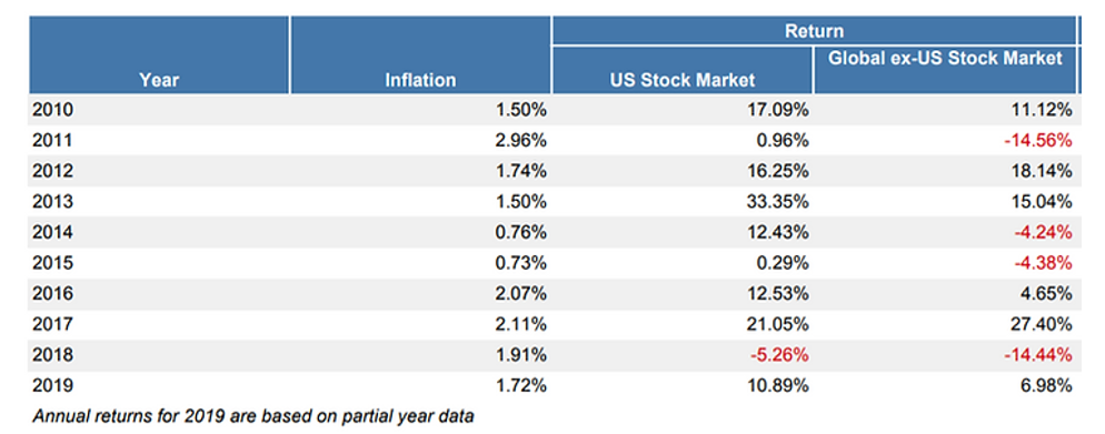
Source: PortfolioVisualizer.com
The above graphics tell a story of U.S. dominance relative to the global market index from 2010 to May 2019. $100,000 invested in the U.S. market would be worth more than double ($295,758) vs. the global index ($144,189).
While recent performance favors the U.S., it hasn’t always been this way: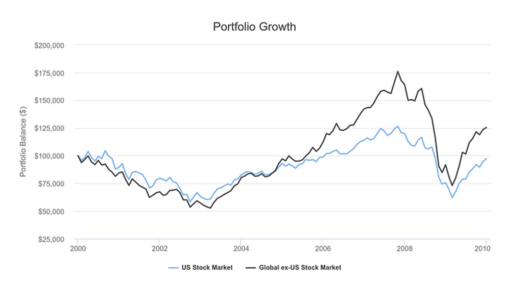

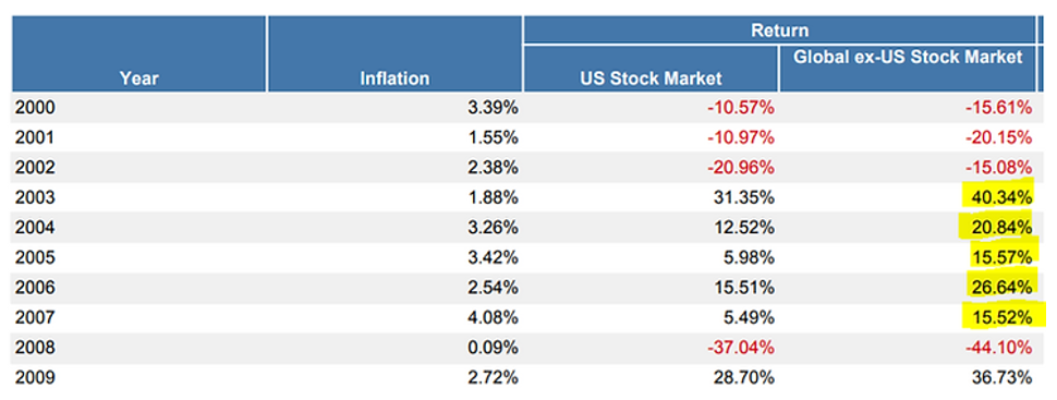
Source: PortfolioVisualizer.com
The above graphics highlight the lost decade for U.S. Stocks. From 2000 to 2009, $100,000 invested in the U.S. stock market would only be worth $97,326. The global stock index outperformed U.S. stocks by over 2.50% per year! The period from 2003 to 2007 was particularly strong for global equities.
In our opinion, the case for global diversification at this point in the market cycle is strong.
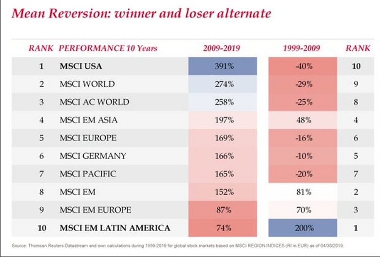
Throughout history, financial markets tend to revert to the mean. In other words, what’s worked will stop working. What’s been broken, will eventually outperform:
Source: Thomson Reuters, Meb Faber
The above graphic shows the worst performing markets from 1999-2009 were often the best performers the following decade. The opposite is true for Latin America (number 10 at the bottom).
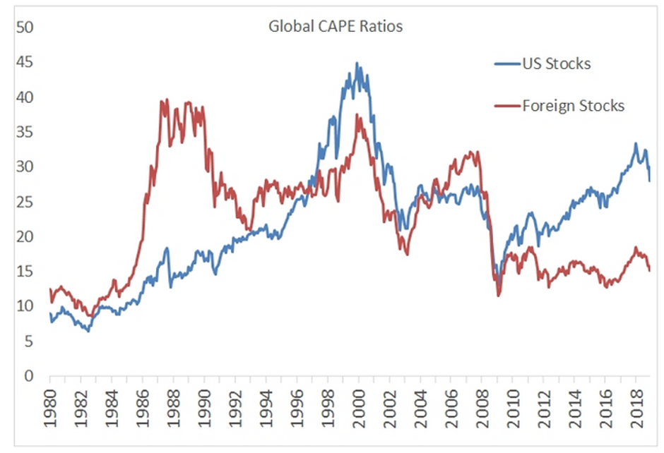
Valuation is a lousy timing tool, but current levels have been a decent predictor of future returns. For example, if you buy a home for a 50% discount relative to the current market price, your future returns will be higher than buying at a 50% premium.
Source: Global Financial Data, Meb Faber
The above graph shows the large valuation gap between U.S. stocks (blue) and Foreign stocks (red). The Cyclically Adjusted Price to Earnings or CAPE ratio uses the past 10 years of earnings data (this helps smooth out the valuation data).
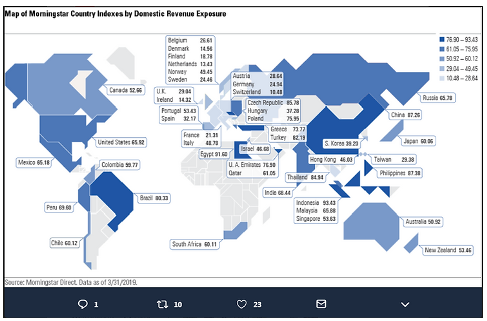
Supporters for U.S. heavy portfolios tout the foreign revenues U.S. companies generate as a natural diversifier. Ironically, this is a rather naive viewpoint exhibiting more home bias.
Source: Morningstar Direct Data
The above graphic shows the percentage of domestic revenues generated by each country (what percentage of goods and services are sold within each respective country). The dark shades represent heavy domestic exposure or not much in foreign revenues. The light shades represent countries where most of their corporate revenues are generated abroad.
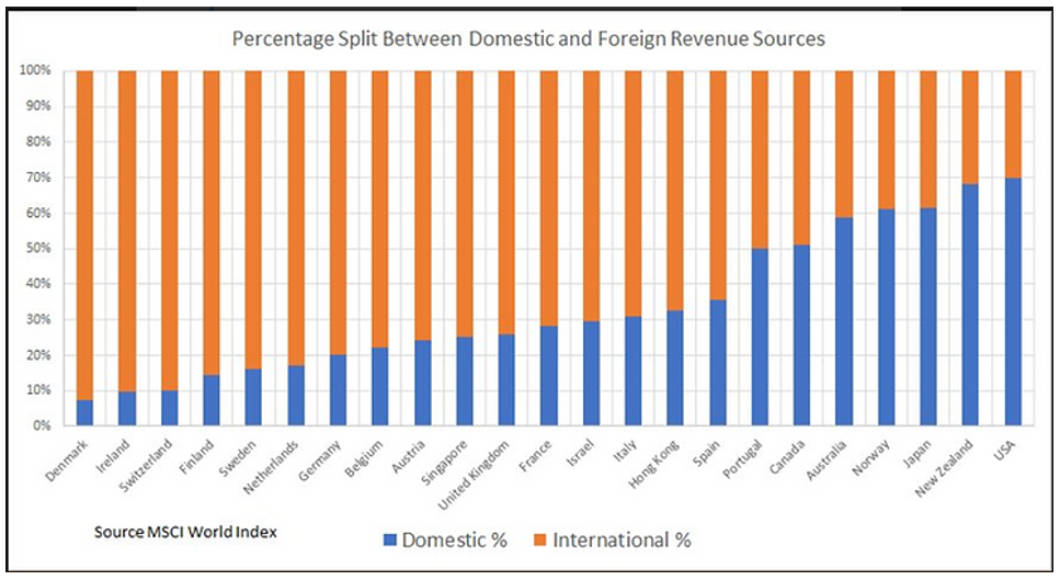
The U.S. is hardly alone is generating foreign revenue. In fact, out of 23 major developed economies, the U.S. generates the least amount of foreign revenue:
Source: MSCI World Index, Meb Faber
The above graphic shows U.S. companies generate about 35% of their revenue from international buyers (far right). On the opposite end, Denmark generates over 90% of its corporate revenue from international buyers (far left)!
It’s easy to get caught up in the recent outperformance of U.S. markets. Take an objective look at your equity allocation. Do you have a large concentration of U.S. stocks? The evidence suggests you could be on the wrong side of history when the cycle turns.
Find out how we invest in foreign equities by clicking here.
Share your questions and feedback on Twitter @pureportfolios or insight@pureportfolios.com
