“Trump will fire off a tweet and tank the economy.”
“The yield curve inversion all but guarantees a recession is right around the corner.”
“Tariffs will derail the recovery.”
‘”The Fed is going to raise interest rates too fast/slow.”
We have all heard a variation of the above to predict the next economic downturn. When it comes to the current market and economic cycle, predictions have been wrong, more still have been wildly wrong.
It’s well documented we aren’t interested in forecasting or predictions, but ideas and theories do have our attention.
We keep coming back to Hyman Minsky’s simple, but relevant theory on economic cycles:
“All stable economies sow the seeds of their own destruction.” – Hyman Minsky, Professor of Economics, Washington University.
In other words, “stability breeds instability” is the idea that as people feel good about current economic prospects they tend to consume, take on debt, speculate, etc. The risk-seeking behavior can create imbalances or excess leading to economic instability.
We have put together a collection of economic data points alongside the S&P 500. On the surface, these favorable metrics would elicit positive feelings about current economic prospects, including future stock market returns. The reality has been a bit different, good economic data today can be inversely correlated to future stock market returns. Stability breeds instability.
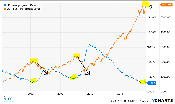
The above graph shows the U.S. unemployment rate going back to the mid-1990’s (blue line). The yellow highlights show a relationship with unemployment lows and S&P 500 peaks. On the surface, low unemployment would seem to be a good thing for the stock market, however, recent history would indicate the opposite.
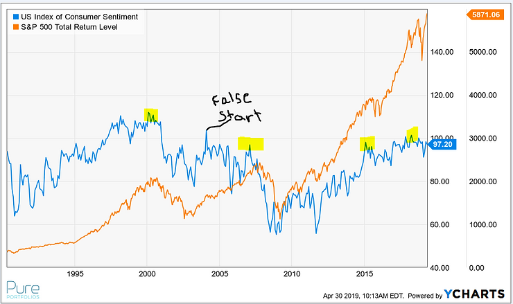
The above graph shows U.S. Consumer Sentiment (blue line). A negative relationship seems to exist with the S&P 500. When U.S. consumers felt the most confident, stock market returns took a dive in the early 2000’s, late 2000’s, 2015, and 2018.
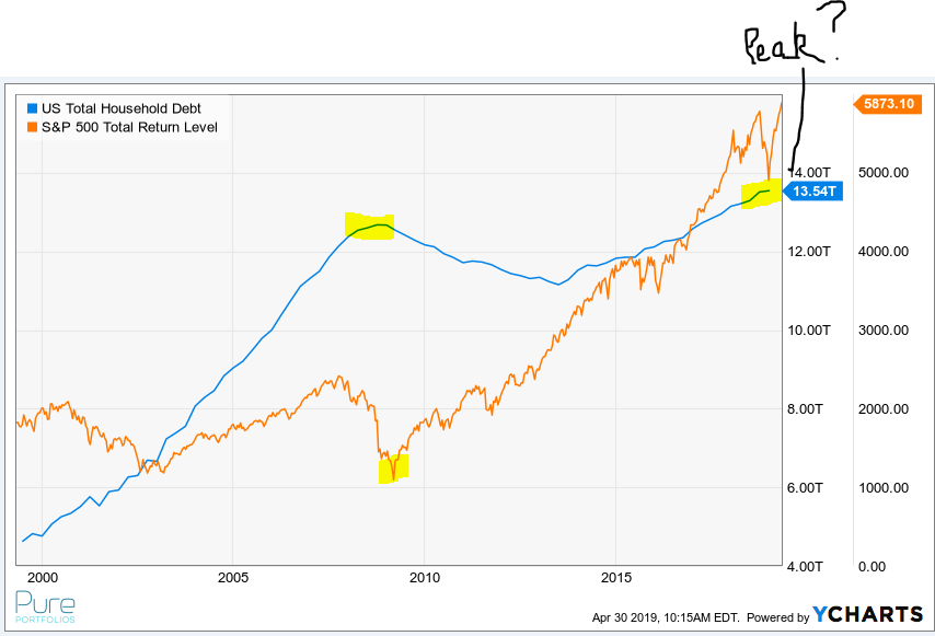
The above graph shows U.S. household debt (blue line). The run-up in household debt in the 2000’s led to the Great Financial Crisis. Currently, U.S. households have more debt than the previous cycle peak.
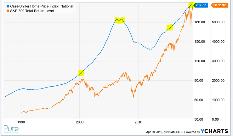
The above graph shows the Case-Shiller Home Price Index (blue line). A similar pattern exists as U.S. household debt. Conceptually, this makes sense as most households borrow to purchase their primary residence.
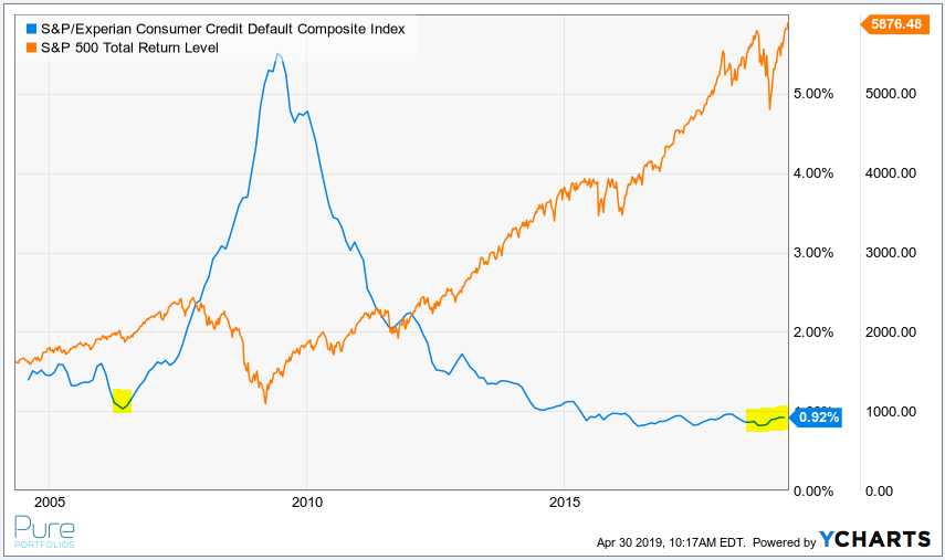
The above graph shows the S&P/Experian Consumer Credit Default Index (blue line). The rate of consumers defaulting on debt is at a cycle low. Combined with the record amount of U.S. household debt, this could be a point of stress during the next economic downturn.
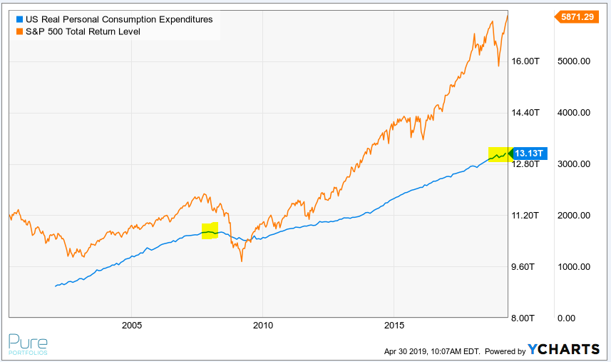
The above graph shows U.S. personal consumption expenditures (blue line). Americans love to buy stuff, especially when times are good. Unfortunately, we like to buy stuff on credit which doesn’t create much margin for a job loss or wage cut/stagnation.
The above collection of graphs doesn’t mean an economic downturn is right around the corner, but in our opinion, late cycle yellow lights are flashing.
Extrapolating the good times into the future could be dangerous. The next big financial or investment decision you make, may the words of Hyman Minsky enter your thought process: stability breeds instability.
Share your questions and feedback on Twitter @pureportfolios or insight@pureportfolios.com
