“In the end, how your investment behaves is much less important than how you behave.” – Benjamin Graham, famous investor
Much had changed, but nothing felt different. Despite going from two to six associates, we were still siloed off working from home. Today was the first day the entire Pure Portfolios team would gather for a meet and greet.
We exchanged pleasantries and introductions. Someone asked our newest partner, Toby, what type of investor he was…
“I tend to be risk averse. I’m a fundamental investor and given current valuations, I could argue a cautious approach is warranted.”
David Gewant, Pure co-founder chimed in…
“I think of myself as a value investor. I enjoy trading individual stocks.”
The question came around to me. What type of investor are you Nik?
“There’s merit to those philosophies to be sure. I prefer to take my cues from financial markets.”
The room fell silent.
What the heck does taking cues from financial markets mean?
It means paying attention to the information financial markets are giving away to everyone (for free).
The opposite approach is dizzying. A firehouse of information, data, opinions, research, and commentary, while often credible and smart sounding, can leave you wondering, what should I believe?
Consider…
- There are smart people who think the market is going to hell in a hand basket.
- There are smart people who think the market has room to run much higher.
- There are smart people who think inflation is going to be a long-term problem.
- There are smart people who think inflation is a temporary blip.
For a wide range of topics, earnings, interest rates, sectors, etc. you can find brilliant people literally making the opposite case.
Throw in the experts and analysts that are trying to sell you something and it can feel overwhelming. For example, the bond fund manager who proclaims equities are going to crash. The annuity salesperson who offers guaranteed returns to mitigate the stock market volatility. The equity fund manager who thinks stocks are going to rip higher.
Each of these market participants stands to economically benefit if their “forecast” is correct. They form blind allegiances to their version of the world.
Investors end up getting sucked in to the noise, while missing the important signals the market is giving. Said differently, people can say whatever they want. I want to know how are investors voting with their capital.
Here’s a sampling of my favorite market cues and how they compare to popular narratives.
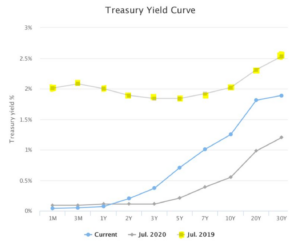
10-Year & 30-Year Treasury Yields
Popular Narrative: Inflation is going to be a long-term problem.
Market Cue: Nothing to see here.

Source: Gurufocus.com
The above graph shows the U.S. Treasury Yield curve today (light blue, as of 7/28/21), July 2020 (gray), and July 2019 (line w/yellow dots). Long-term bond yields, measured by the 10-year & 30-year Treasuries, are historically good proxies for market expectations for growth and inflation. While yields are modestly higher compared to July 2020, they are still below pre-pandemic levels. If the market thought inflation was going to be a long-term problem, you would expect longer-term yields to be much higher.
Global Bond Yields
Popular narrative: Interest rates have to rise.
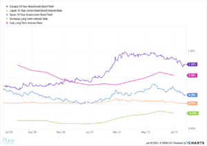
Market Cue: The U.S. doesn’t operate in a vacuum. As long as foreign sovereign bond yields hover around 0%, global investors will find U.S. Treasuries attractive, thus putting a ceiling on U.S. bond yields.

Source: Ycharts
The above graph shows 10-year bond yields for several developed countries. The takeaway is capital flows to where it’s treated best. A U.S. 10-year yielding ~1.25% might look attractive to a Japanese pension fund. It’s amazing how many market participants continue to pound the rising rate narrative, despite low global bond yields.
Market Stress
Popular Narrative: The market is way overvalued. It’s going to crash soon.
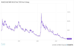
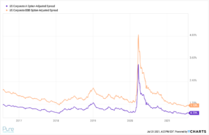
Market Cue: The VIX, and high yield credit spreads aren’t showing signs of stress. Note: things can obviously change quickly. We are simply pointing out a few metrics we track that aren’t flashing yellow.

Source: Ycharts
The above chart shows a short-term volatility ETF. The spikes are periods of market volatility. Notice the violent move higher in spring of 2020 when the equity market was all over the place. Comparatively, 2021 has been a walk in the park with very little turbulence for equity investors.

Source: Ycharts
The above graph shows credit spreads for BBB (orange) and A (purple) rated corporate bonds. When credit spreads go higher, investors demand more in compensation to lend money to lower quality companies. When spreads go lower, investors accept a lower interest rate as economic and/or market conditions stabilize. Credit spreads are often a tool to measure economic stress in capital markets. Lower spreads are often associated with good economic conditions, while higher spreads are associated with economic disruptions. *Credit spreads are the yield difference between a comparable maturity U.S. Treasury and corporate bond.
Would you rather take your investment cues from an individual or millions of investors voting with their capital?
The next time you hear a talking head tell you what happens next, ask yourself if the market confirms or denies what the person is saying.
While narratives can be sexy. In our opinion, market evidence is better.
