Friend: “I need to buy more QQQ.”
Later that day, while on a call…
“Tech stocks make me nervous. I fear a repeat of the 2000 tech bubble.”
Whether you like U.S. technology stocks or not, we can agree they’ve had an amazing run.
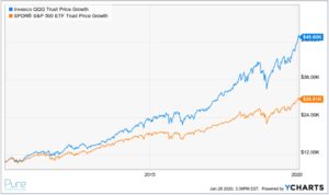
The above chart shows the growth of $10,000 over the past 10 years. QQQ, an ETF tracking the Nasdaq 100, has produced an annualized return of 18.38% vs. 13.79% for SPY (S&P 500 ETF) over the same period.
The pro-technology crowd will cite innovation, the new economy (more service-based vs. making stuff), automation, scale, efficiency, convenience, etc. The anti-technology group will point to personal privacy concerns, monopolies, concentration of power, cybersecurity issues, data misuse, corporate tax “creativity”, etc.
From an investment standpoint, I can’t shake the vision of the guy telling his buddy to buy Amazon stock. More broadly, history has shown the best performing sectors will often be the worst during the next leg of the cycle.
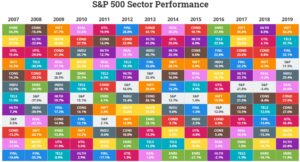
Source: Novel Investor
The above graphic shows S&P sector performance from 2007 – 2019. The columns are sorted by best performing sectors down to the worst performing. The technology sector is represented by INFT (short for information technology, and is highlighted in orange). You can see across sectors, there are several examples of going from best to worst and vice versa. Pick a color and track it from year to year!
Rather than tell you U.S. technology stocks are good or bad. Let’s look at where the polarizing sector stands relative to history, including the early 2000s.

Source: Ycharts
The above graphic shows five tech stocks (AAPL, MSFT, AMZN, FB, & GOOG) make up ~17.38% of the S&P 500 index.
Looking at the NASDAQ, the concentration is more dramatic.

Source: Ycharts
The above graphic shows that the same stocks (AAPL, MSFT, AMZN, FB, & GOOG) make up ~43.69%(!) of the NASDAQ 100 index.
When we track the current weights of the top 5 stocks in the S&P since 1964, things don’t look so top heavy.
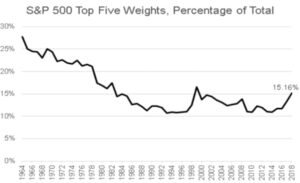
Source: OfDollarsandData Blog
The above chart shows the top five stocks as a percentage of the S&P 500. Back in the 1960s, a handful of “old economy” companies represented over 25% of the S&P 500.
Looking at the S&P Technology sector, how does the current size of the sector stack up vs. recent history (including the 2000 tech bubble)?
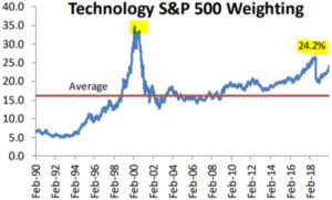
Source: Bespoke Investment Group
The above graph shows the technology sector weight as a percentage of the S&P 500. While currently above average, at ~24%, we are well below the early 2000 tech excesses. We should note, the S&P sectors were recently reclassified to remove Alphabet (GOOG) and Facebook from the tech sector. If we add those back, the technology sector would be ~30% of the S&P 500!
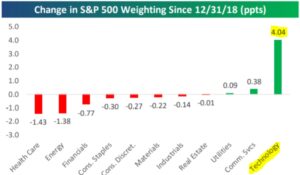
Sector weightings can change rather quickly. 2019 was a perfect example…
Source: Bespoke Investment Group
The above graphic shows the weighting change for every S&P sector in 2019. Tech was the biggest winner, while healthcare, energy, and the financial sectors shrunk in size.
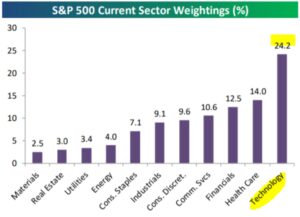
Here’s a look at current S&P sector weightings (as of 1/24/20).
Source: Bespoke Investment Group
The above graph shows S&P sector weightings from smallest (Materials) to largest (Technology). The size of a sector can ebb and flow with the composition of the underlying economy. For example, there was a time when industrials and energy were bigger components of the S&P 500.
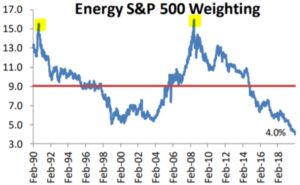
For those technology bulls that think the sector will remain on top forever, look no further than the fall from grace of the U.S. energy sector.
Source: Bespoke Investment Group
The above graph shows the energy sector weight as a percentage of the S&P 500. What used to be a darling sector for investors, energy now only represents 4% of the S&P 500 index. No sector or industry is immune from outside disruption, or falling out of favor with investors.
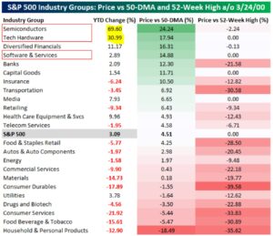
How do technology stocks today compare to the 2000 tech bubble?
Source: Bespoke Investment Group
The above graphic shows YTD returns for several S&P 500 industry sub-groups through 3/24/2000. Semiconductors (+69.60%) and Tech hardware (+30.99%) screamed higher at the beginning of 2000. Each sub-group represented a basket of stocks that investors clamored for regardless of profitability (many were deeply unprofitable) or fundamentals.
Source: Bespoke Investment Group
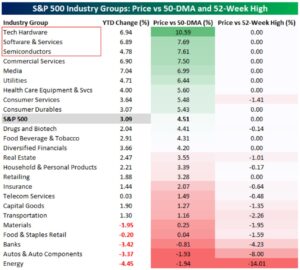
The above graphic shows YTD returns for several S&P 500 industry sub-groups through 1/22/2020. The time period isn’t quite apples to apples, but the difference is clear. While Tech Hardware (+6.94%), Software Services (6.89%), and Semiconductors (+4.78%) are off to a good start in 2020, they are nowhere near as stretched compared to March 2000. Furthermore, the companies in each sub-group (in aggregate) are profitable and exhibit much stronger fundamentals.
Some people tell me they want more technology in their portfolio. I’ve had others say the sector scares them due to nosebleed valuations and the increasing rate of change.
Will the technology sector’s run last forever? Probably not. Are we in tech bubble like 2000? Probably not.
Like most things in life, it’s about balance. If you’re leaning towards either extreme it might be prudent to center your expectations.
To find out how Pure Portfolios allocates to the technology sector, click here or reply to the Sunday Coffee Reads email.
