
Our inbox is bursting with mid-year reviews, commentary, and predictions for the rest of the year. The blitz of content ranges from thought provoking to nap inducing. In the below post, we select the most interesting graphs from the first half of 2019. The content is graph heavy and commentary light. These graphs provide a snapshot of the state of the economy, stock market, and key sectors.
*ALERT* This isn’t a forecast, nor do we provide any absolute conclusions about what may happen next.
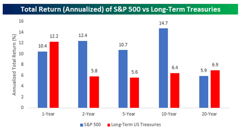
Source: Bespoke Investment Group
The above graph shows annualized performance for the S&P 500 (blue) and Long-Term U.S. Treasuries (red). Would you be surprised that Long-Term Treasuries have outperformed the S&P 500 for the past 12 months? Despite the superb start for equities in the first half of 2019, that’s precisely what’s happened. Notice the 20-year period as well (far right), the S&P 500 is trailing Long-Term U.S. Treasury returns due to the weight of the Great Financial Crisis.
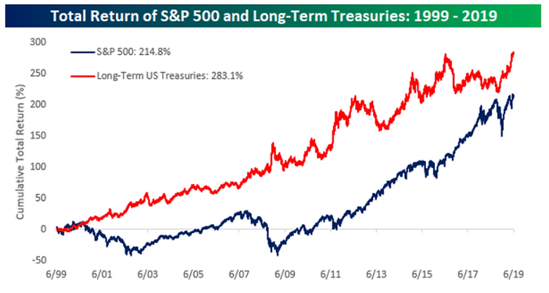
Source: Bespoke Investment Group
The above graph shows a total return view of the S&P 500 (blue) and Long-Term U.S. Treasuries (red). Notice the wide divergence in 2008 & 2009. The power of diversification is alive and well in this snapshot.
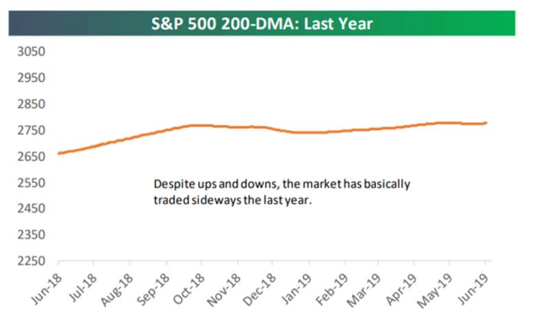
Source: Bespoke Investment Group
The above graph shows the Daily Moving Average (200 day) of the S&P 500 over the past year. Despite violent market movements in late 2018 and May 2019, not much has happened on an absolute basis.
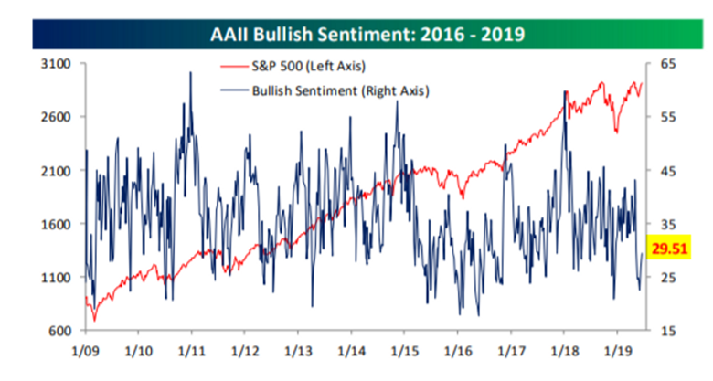
Source: Bespoke Investment Group
The above graph shows bullish (optimistic) sentiment for individual investors (blue line). Despite the steady rise of the S&P 500 (red line), individual investor euphoria remains subdued. Some analysts say the lack of investor exuberance is the most bullish signal of all.
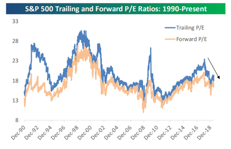
Source: Bespoke Investment Group
The above graph shows trailing and forward price to earnings ratios (P/E) for the S&P 500 since 1990. Compared to recent history, valuations aren’t excessive.
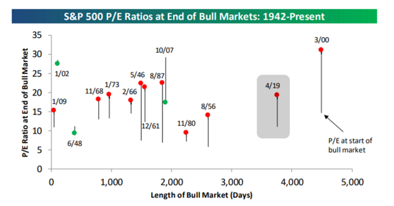
Source: Bespoke Investment Group
The above graph shows beginning P/E and ending P/E for every bull market since 1942. Although our current run is approaching 4,000 days (bottom axis), we aren’t anywhere near the >30 P/E ratio readings in the spring of 2000. Solid earnings growth has kept P/E ratios consistent with other bull market runs.
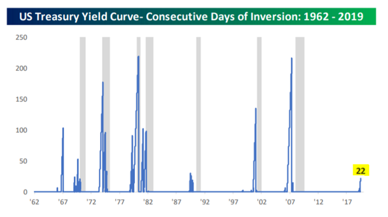
Source: Bespoke Investment Group
The above graph shows consecutive days of yield curve inversion since 1962. Much has been made about the predictive power of an inverted yield curve (grey shaded areas are periods of recession). You can see the longer the yield curve remains inverted (left axis in days), the more imminent recession risk becomes.
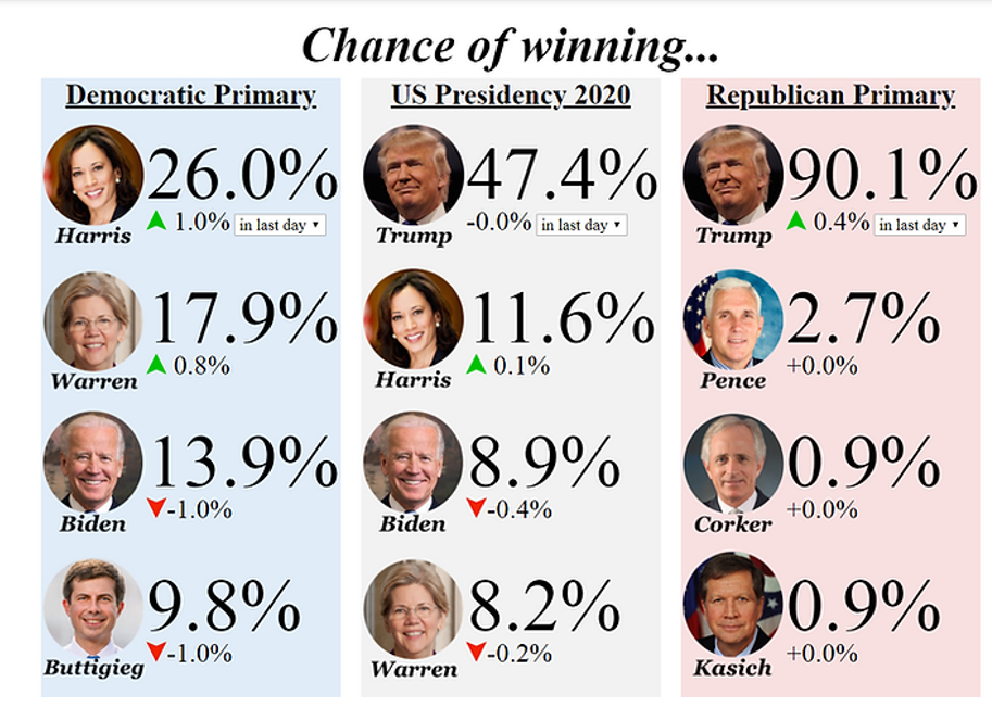
Source: Electionbettingodds.com
The above graphic shows updated odds (as of 7/2/2019) for the upcoming Democratic primary, U.S. Presidency (middle), and Republican primary (right). We can expect the rhetoric and vitriol to grow more intense as the 2020 election approaches. No matter your political affiliation, history has shown that mixing politics and investing is a dangerous and fruitless exercise.