One of the funny things about the stock market is that every time one person buys, another sells, and both think they are astute.” – William Feather, American publisher & author.
We recently finished the usual round of year-end meetings and conversations. Undoubtedly, many of our clients wanted our opinion of the recent market turmoil. We kept repeating a variation of the following, “2018 was one of the weirdest years of our career.”
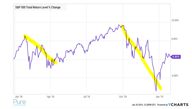
We don’t say that to be cheeky or cute. It’s our honest assessment. In this case, a picture is worth a thousand words.
Source: YCharts
The above graph shows the S&P 500 (total return) since January 2018. It’s pretty rare to get two significant pullbacks in one calendar year.
We wondered if there’s any other market periods that tracked the odd price action of 2018?
Warning! This is not a forecast piece. We understand one can look at any number of data points to make an optimistic or pessimistic case. You will find neither in the commentary that follows. This is more a collection of data and graphs we find interesting, looked at through a historical lens. For more on the the idiocy and futility of stock market forecasting, please see Tis the Season for Wall Street Forecasting.
 Source: Bespoke Investment Group
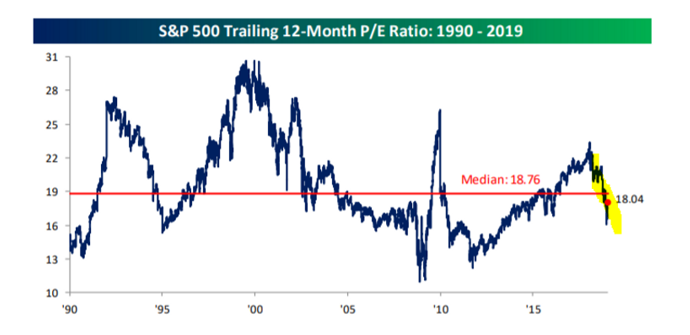
The above graph shows the S&P 500 is finally below the median P/E ratio of the last 29 years. In other words, U.S. stocks got cheaper. This comes with a slight caveat, valuation over the short-term is utterly worthless as a predictor of returns. Over a longer period, it becomes more meaningful. As a general rule, it’s definitely better to buy when stocks are cheaper rather than expensive.
 Source: Bespoke Investment Group
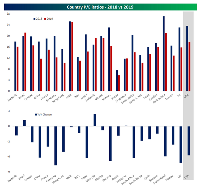
The U.S. wasn’t only the only market to get cheaper. The top graph shows most global P/E ratios contracted from 2018 (blue) to 2019 (red). The bottom graphic shows which countries saw the largest valuation changes. Will foreign stocks finally show signs of life in 2019?
Source: Bespoke Investment Group
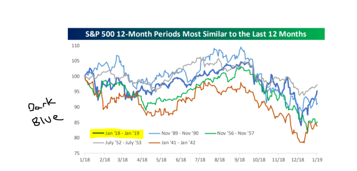
What about similar periods throughout history? The above graph shows S&P 12-month periods that are most similar to the last 12 months (bold dark blue). Our research partner, Bespoke Investment Group, runs this exercise regularly often finding several periods with correlations over 0.90% (very similar return paths). However, during the last 12 months, Bespoke was only able to find four periods with correlations over 0.75%. The most recent period was undoubtedly unique!

Source: Bespoke Investment Group
For the four market periods most like the recent 12-month period, the above graphic shows returns for the following one, three, six months, and one year. You can see the one-year returns look particularly strong.
 Source: Bespoke Investment Group
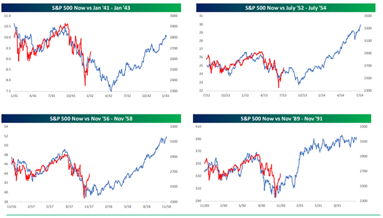
The above collection of graphs is a visual version of the previous table. In every period, the one year forward returns (ascending blue line) were overwhelmingly positive (again, not a forecast, but rather an observation). The red line shows the S&P 500 over the past 12 months (S&P Now).
 Source: Bespoke Investment Group
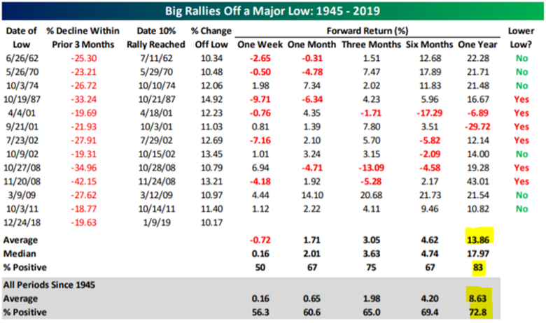
What about big rallies off a major low like we are experiencing now? The above graphic examines large declines within the previous three months (second column in red) and forward returns over the next year. You can see the average return coming off a major low is 13.86% vs. 8.63% for all periods since 1945. It’s not all good news, you’ll notice some ugly exceptions. Most notably in 2001!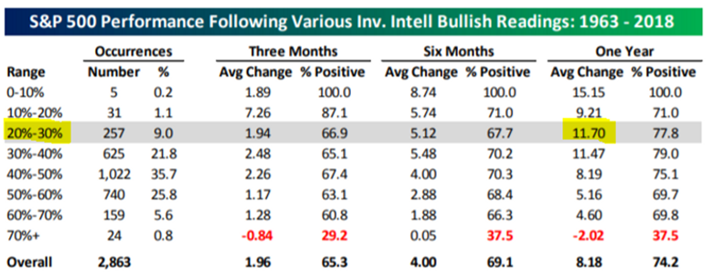 Source: Bespoke Investment Group
The above graphic shows investor bullish (optimistic) sentiment over the past 45 years. The January 2019 reading came in at 20-30% of investors being classified as bullish. Historically, at these sentiment levels, the following 12 months have averaged a healthy 11.7% return. Sentiment is hardly excessive and shows investors are still exercising a bit of caution. Interestingly enough, future returns are the worst when investors feel the best about the stock market (bottom row in red).
It turns out, our intuition of weirdness is supported by empirical evidence. Although the data pieces we highlighted could infer an optimistic lean on our part, that is not the case we are trying to make. We are students of market data and understand absolute conclusions to be dangerous.
If your advisor, confidant, friend, etc. make grand prognostications or forecasts, don’t listen to them. People can say whatever they want without consequence and they’ll never tell you when they drive their portfolio into the ground.
