The inflation report on 6/10/22 caused shockwaves across financial markets.
The Consumer Price Index (CPI) print surprised on the upside, which wasn’t a good thing.
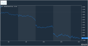
The S&P proceeded to do this…
Source: Koyfin
The S&P 500 (SPY) has fallen ~10% since the latest CPI report was released on 6/10. Most pundits were looking for signs inflation was slowing. We got the opposite.
Inflation reports are not a singular, neat & tidy number.
There’s headline inflation.
Core inflation.
Rent inflation.
Durable goods inflation.
Services inflation.
Predicting changes in inflation is difficult, if not impossible.
More confusing still, the market is looking for changes in inflation relative to expectations.
For example, in the latest report, headline CPI rose 1% month over month. The expectation was for headline CPI to rise by 0.7%.
Core inflation jumped 0.6%. The expectation was for core CPI to rise by 0.5%.
Seemingly insignificant misses can be market moving events.
Let’s dive in.
Headline Inflation
Headline inflation is the most “raw” inflation figure reported by the Bureau of Labor Statistics (BLS). The basket of goods & services used to calculate inflation includes food & energy prices.
Headline inflation can be noisy due to the wild swings of food & commodity (think energy) prices. However, consumers purchase food & gas every day, which makes headline inflation a realistic barometer for prices.
Source: Koyfin
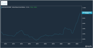
The above chart shows food inflation in the U.S. over the past decade. Labor shortages, supply chain issues, energy prices, geopolitical events, weather, COVID, have contributed to the rising cost of food.
Source: Bespoke Investment Group
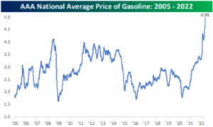
The above chart shows the AAA National Average Price of Gas (2005 – 2022). This is the average, several markets i.e. California are reporting ~$9+ per gallon!
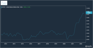
Runaway food + gas prices = headline inflation that exceeded market expectations…
Source: Koyfin
What happens when we strip out food & energy prices?
Core Inflation
Core inflation is the price change of goods and services minus food and energy. Food & energy are removed due to their volatile price action.
Source: Bespoke Investment Group
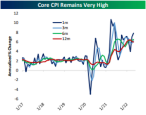
The above chart shows Core CPI (minus food & energy) rate of change over several time periods. You can see the annualized one-month change (dark blue) spiked higher, indicating core inflation accelerated in May.
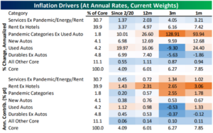
Here’s a granular look at what added to and subtracted from core inflation…
Source: Bespoke Investment Group
The above data set shows inflation drivers over several time periods, including the percentage weight of each category (top) and contribution (bottom). The orange shade indicates categories where prices are rising. Blue highlights categories that are slowing or falling.
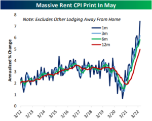
Drilling down further, we can see rent is the largest weighting in calculating core CPI (~40%). Rising rents were a major reason inflation surprised to the upside on 6/10.
Source: Bespoke Investment Group
The above shows the annualized rate of change for rent over various time periods. The spike in mortgage rates has essentially doubled borrowing costs for buyers. The impact is showing up in higher rents.
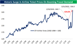
The consumer is showing no signs of slowing down as travel demand booms.
Source: Bespoke Investment Group
Despite rising prices across most categories, the U.S. consumer continued to spend on discretionary services i.e. travel in May.
While the inflation report on 6/10 was the opposite of what the Fed wanted, it’s not all bad…
Source: Bespoke Investment Group
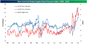
The above chart shows U.S. CPI (dark blue) and the Producer Price Index (PPI, light blue) vs. the New York Fed’s Supply Chain Pressure Index (red). Supply chains have loosened up the last few months.
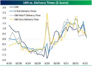
The Logistics Managers’ Index (LMI) data from May confirms supply chains stress is easing with faster delivery times…
Source: Bespoke Investment Group, LMI May Report
Looser supply chains and quicker delivery times could ease price pressures in the coming months.
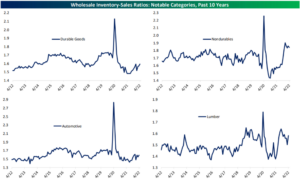
We outlined in our previous post, “What Does Peak Inflation Look Like?,” inventory levels needed to rise.
Ask and we shall receive!
Source: Bespoke Investment Group
The above graphs show durable, nondurable, automotive, and lumber inventories. When inventories are low, consumers are buying stuff and businesses can’t restock fast enough. A rise in inventories might suggest consumer spending is starting to roll over which often leads to discounts (lower prices).
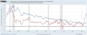
The below chart sums up the Fed’s conundrum perfectly…
Source: Board of Governors, Bureau of Labor Statistics
The above chart shows the yield for a 30-year constant maturity U.S. Treasury (blue) and CPI for Urban U.S. Consumers (red). The Fed needs the gap between the red and blue lines to converge, without crashing the economy. Easier said than done.
The Fed desperately is looking for a natural slowdown in inflation.
The latest report shows how far behind the curve the Fed is.
For more reading on inflation…
